Doing paid ads isn’t as easy as it used to be. With so much noise and competition, what used to work in the past may no longer yield the same results. Even if your ads are incredibly optimised, an ad account can often hit a point of stagnation where more dramatic changes are required to increase leads and lower CPA costs.
The question then becomes, how can we audit and improve our paid media ads to improve our results?
Enter the 5 point paid ad audit framework, designed specifically to create more compelling, user centric ads to improve your paid media results.
In this article, we’re going to cover:
What is the 5 Point Paid Ad Audit?
Auditing and optimising ads can be incredibly subjective. What we can all agree on however, is ads must be compelling, offer a real solution but also, meet the expectation on the eventual landing page. The 5-point ad framework forces you to address these areas and more and, in our experience, is one of the fastest ways to turn a bad ad account around.
When we utilise digital paid media advertising there’s 5 key things that we need to get just right in order to ensure our success. These 5 things form the crux of the paid ad audit and include:
- Offer
- Copy
- Creative
- User Experience
- Targeting

If we can nail just these five things, then our chances of positive ROI and success from advertising increases dramatically. In the above image, we can see a criteria ranking system which is used to judge success of each of these five aspects. Later in the article, we’ll use this framework to review ads so that you can see exactly how we use this audit.
But first, what do these five things actually mean?
Offer
The offer is the solution you’re providing to the user in exchange for something in return. An offer could be a service you’re selling, a product, or a lead magnet such as a free eBook.
In digital marketing, it’s so easy to skip this part of the equation, and to be honest, this is where the majority of people make a mistake. Do people really care about what you’re offering? Are you actually touching on a pain point?
At the end of the day, it doesn’t matter how good your copy, creative, user experience and targeting is if you’ve got a weak offer.
So, what makes a great offer?
The obvious thing to say is that a great offer is something that people actually want. However, the answer is a little more nuanced than that. In order to understand what makes up a good offer, we must consider the thought process that underpins a purchasing decision.
Ultimately, the purchasing decision is guided by a variety of psychological motivators which can be categorised in the following categories:
- Hopes and dreams
- Pain points and fears
- Barriers and uncertainties
In order to create a great offer, we must present something to the market that directly targets one of these motivators. By doing so, we create desire in our target audience, creating the opportunity for a purchase at some point along the customer journey. By doing this, we can create a great offer that truly speaks to our target audience and provokes users to take action on our ads.
EXAMPLE
Poor Offer
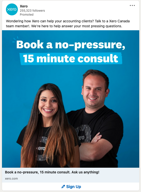
In the above ad for Xero accounting software, the offer benefits largely Xero, not the prospect. There is no pain point addressed, no hopes and dream aspiration and no barrier addressing. It’s also high friction. It’s asking someone to book in time with a probably pushy salesperson (despite what the ad says).
Good Offer
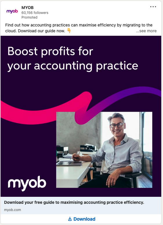
Compare Xero’s ad with MYOB’s ad. Unlike Xero asking for a high friction sales call, it’s a low friction download that asks for an email address and phone number. It’s also very targeted. We’re not just talking about boosting profits for a business, it’s specifically (and exclusively) for accounting practices. It’s very powerful to define exactly who your offer is for rather than being all things to all people.
Copy
Copy is how we present the offer using words – it can be thought of as the message that our offer is packaged in. Good copy should speak to our target audience’s key motivators and guide them into taking an action that resonated with our objective.
In our ad copy, we should also focus on a few things:
- Keeping it personable – we want to make our ad copy conversational and use the sort of vocabulary that our target audience would use. Remember, we’re speaking to real people, so our copy needs to reflect that.
- Mention the key benefits – we want to make sure we mention the key benefits of the offer in our ad, taking particular note to focus on any key motivators and addressing pain points.
- Ensuring the copy includes a call to action. We want to make sure that we ask our audience to do something, and that what we ask of them is very clear and easy to do.
- Don’t make your prospect consume too many calories. In other words, don’t make them overthink. It’s for this reason we usually recommend writing at a 12 year old’s level of English.
If we focus on speaking to the audience’s key motivators as well as the above four things, we’re going to be writing good copy, nine times out of ten.
EXAMPLE
Bad Example
Nespresso is a patented, capsule based technology that innovatively delivers 15 bar pressure to coffee granules at three distinctive temperature-controlled settings.
Good Example
Barista level coffee at a touch of a button in your home.
It’s easy to laugh at the difference between the above two stark examples but too often we take the wordy, complex route that asks prospects to burn too many calories. When it doubt, go KISS (keep it simple stupid).
Creative
When it comes to paid media ads, especially social and video ads, creative is the most visual component and often the biggest factor that will help you stand out.
A creative refers to any graphic or video which you are using for your advertisement. There are four focus metrics that make up a great creative:
- High thumb stopping rate: this metric is calculated by the percentage of 3 second video views divided by the total number of impressions for any video ad. This metric demonstrates the percentage of users that continue watching after the first three seconds of a video, which reflects the power of the hook of the ad. We want our thumb stopping rate to be high so that we can capture users as they scroll on social media. The key to increasing this metric is optimising the first three seconds of the video to effectively capture attention. We should strive for a 30% thumb stopping rate on traffic or conversion based campaigns. If you’re using an image ad, you can’t directly measure this metric, but you can look at your creative and think about what you expect the scroll stopping power of your image will be.
- High Click-through rate (CTR): this metric is calculated as the percentage of users who have seen an ad and have clicked through to the landing page or website. The CTR reflects the power of the ad to spur initial action from our target audience, in the form of a click-through to a website or landing page. If we can get our potential customer to commit to clicking through to view our website or landing page, it is easier to get the user to commit to other things later on, such as a purchase or sign up.
- Video Watch Rate: this metric is calculated as the percentage of users that started watching a video ad who finished watching the video to completion. While the thumb stopping rate tells us how powerful the hook is, the video watch rate tells us how engaging the rest of the video is. It’s important for our video ads to be more engaging because this helps us build interest and desire in our audience.
- Conversions: this could refer to leads generated or purchases, for example. Conversions are important to look at because they determine how successful an ad has been at actually helping us reach our goal. We use HubSpot to accurately attribute our revenue to marketing activities such as paid media.
User Expectation Experience

User expectation experience is all about the experience a user has from the moment they see the ad to the moment they click through to the landing page or website. The expectation part looks at whether the design elements from the ad are reflected on the landing page.
This takes into account both the user’s experience with the landing page but also the expectation that should have been met after clicking through.
It’s essential to have a positive user experience based on expectation as this builds trust and promotes conversion actions from our target audience, ultimately leading to an increase in revenue. So, how do we ensure a positive user experience?
To provide a positive user experience, we want to focus on:
- Design: ensuring that the look and feel of the creative in terms of colour scheme, font, and more is similar to what is used on the landing page.
- Congruency in benefits: ensuring the headline, sub headline, and image/s on the landing page highlight the same benefits as the ad.
- Congruency in offer: ensuring the same language and overall message is being used from the ad to the landing page.
Overall, we want to ensure that what and how we present our advertisement has similar to themes to the presentation of our landing page. This builds trust and promotes a positive user experience.
Targeting
It doesn’t matter how great your offer, creative, copy and user experience is if you target an audience that doesn’t resonate with the solution you’re providing. Targeting is all about finding the audience that matches with what you have to offer.
Your targeting and creative choices should be considered in tandem. There’s no point in running the MYOB ad example we shared above with a broad targeting option.
There’s two approaches you can take with targeting on paid media channels such as Facebook and Instagram.
- You can target broad audiences, and only define the audience further by age, gender, and location.
- You can target interest-based audiences and test different pockets of the broad audience to find winners, and scale those winners once discovered.
In the first approach, you’re letting the algorithm decide who your ad is served to. If we want to get a little technical, this strategy is great for testing ad creative, because you can have the same audience per ad set, but use a different creative each time. However, the downside with this strategy is that you’re giving the algorithm more control to choose who your ad is delivered to. You might also say this is a positive point, because the algorithm has the power to find the right people for your offer. You also need to consider a higher budget before the algorithms find their sweet spot.
In the second more targeted approach, we control who our ad is delivered to by using a single interest per ad set. There are two downsides with this approach. First, you might miss out on delivering your ad to audiences that would have resonated with your message. And second, it’s difficult to test ad creative in this way, because every ad set is differentiated by the audience you’re using, so an a/b test with creative isn’t necessarily pragmatic. On the opposite side of the coin, this approach can be extremely valuable, because we can end up finding pockets of audiences which react really well to our ads, giving us the opportunity to scale results from these specific audiences.
One great strategy you can use for targeting is to combine the above two approaches, where you use broad targeting to a/b test creatives, and then use the successful creatives in a second campaign where you run interest-based targeting.
What’s clear here is that there are most definitely different approaches that you can take when it comes to targeting, but the key is to create a strategy that works for you. Rather than focusing on the technicalities of targeting across each platform, it may best to focus on getting at least the following right:
- Targeting to a specific part of your market
- Targeting to a relevant location, age range, and gender
- Asking yourself the question, who does my ad appear to be targeted towards? This allows us to ensure our ad speaks to a particular segment of our market regardless of the targeting strategy that we use.
Now that we’ve covered the five aspects of our ad to focus on and what they mean, we’re going to look at how to use the five-point audit to improve results.
How to Use the 5 Point Audit to Improve Results
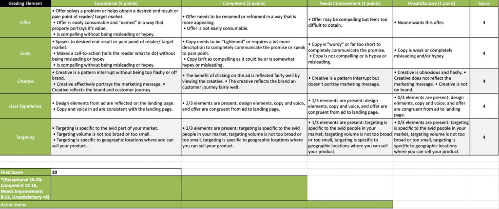
Basically, for each ad, we need to look at the offer, the copy, the creative, the user experience and the targeting, and judge them each on a four scale criteria, which includes:
- Exceptional (4 points)
- Competent (3 points)
- Needs Improvement (2 points)
- Unsatisfactory (1 point)
Depending on which grading you give, a different point score will be applied to the ad as shown above. After ranking the ad on each of the five aspects, the score is summed up to give your ad an overall rank.
Here’s an overview of where your ad sits based on the total score it receives:
- Total Score of <8: Unsatisfactory
- Total Score of 8-12: Needs improvement
- Total Score of 13-16: Competent
- Total Score of 17-20: Exceptional
Now that we know how to use the ad audit system, let’s take a look at an example or two.
An Example of An Ad Audit That We Conducted
Fitness Playground: Example 1
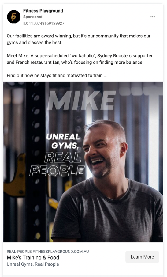
Let’s assess this ad by looking at each part of the 5-point audit framework and assigning a score.
- Offer: the offer for this ad is fantastic. It directly speaks to the customer pain point of having a busy schedule and not being motivated to train while also speaking to the customer hope of having a great community to train in. This offer fits the criteria for an exceptional offer so we will award this ad 4/4 points for the offer.
- Copy: this copy is personable, mentions the key benefit of the offer, includes a clear call to action, and speaks to the customers key motivators. However, the copy could include more information on what exactly the user will get by clicking on the ad. As such, we’ll be giving this ad 3/4 points for the copy.
- Creative: this creative can’t be ranked for thumb stopping rate and video watch rate because it is not a video ad, however, we can look at the expected click through rate, expected scroll stopping power, conversions, the level of pattern interrupt it has, and whether it conveys a brand story or not. This creative definitely highlights the brand story by emphasising the key benefit of people and community, both through the image and the text on image. However, to truly highlight the benefit of community and portray this as their brand story, a more organic, UGC (user generated content) style creative with more than one person together experiencing the communal aspect of the gym would be better. Fitness Playground could keep the high polish nature of the ad if they wish, but it would be better to have less vague text. So for instance instead of ‘unreal gyms, real people’ have ‘Mike 46, workaholic and balance chaser’. Further to this, although the benefit is clear from the image, the offer is not completely clear. On top of this, this image may not have high scroll stopping power. Generally, images that work best at stopping users from scrolling in the news feed are those with vibrant colours or UGC style creatives that do not initially look like a typical ad. While this is the case, the creative does still display the benefit, so we’ll give this creative 2/4 points.
- User expectation experience: the user experience is fantastic. The message, design and offer on the landing page is very much in sync with what is portrayed on the ad. However, we’ll deduct a point because the value of having Mike’s training plan and diet plan isn’t sold well enough in the ad. In short, 3/4 for user expectation experience.
- Targeting: while we can’t see exactly who this ad is targeting because we don’t have access to this brand’s ad account, we can look at who the ad appears to be targeting. Clearly, the ad seems to be targeting middle to older aged men who work a busy job and find it difficult to find time and motivation for exercise. This is hitting a clear target market, so we’ll give this ad 4/4 points for targeting.
Overall, this had has received a total of 16 points, which we would deem as a good score.
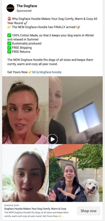
Dogface: Example 2
- Offer: the offer for this ad is fantastic. It directly speaks to the customer dream of making their dog warm, cozy and comfortable. It also speaks to a key customer uncertainty around whether the dog clothes would be suitable for winter only. However, this offer is very hypey which decreases trust. As such, we’ll be giving the offer for this ad 2/4 points.
- Copy: this copy is personable, mentions the key benefits of the offer, includes a clear call to action, and speaks to the customers key motivators. However, it is quite hypey and this may decrease trust. As such, we’ll be giving this ad 2/4 points for the copy.
- Creative: the thumb stopping rate for this ad is expected to be high because of the image thumbnail used, which is a pattern interrupt and has scroll stopping power. The fast paced aspect of the video is likely to keep users engaged for a longer period of time (thus increased video watch rate) and the social credibility and organic nature of the video is likely to spur action. While different variations of this creative should be tested, we have to give this creative 4/4 points.
- User expectation experience: The message, design and offer on the landing page is very much in sync with what is portrayed on the ad. We have to give the user experience 4/4 points here.
- Targeting: while we can’t see exactly who this ad is targeting because we don’t have access to this brand’s ad account, we can look at who the ad appears to be targeting. Clearly, the ad seems to be targeting younger females who own dogs. This is hitting a clear target market, so we’ll give this ad 4/4 points for targeting.
Overall, this ad has received a total of 16 points, making it a competent ad with some improvements to be made across the copy and offer.
As you can see, the five-point ad audit system is absolutely ideal for auditing any paid ad, whether it be your own company’s ad, your client’s ad, or a potential customer’s ad. Increasing a score by even a couple of points could have a dramatic impact on an ad’s CTR, relevancy and ultimately, sales.
So, what’s next?
Paid media is fantastic and can definitely help you scale your brand, but you also might want to consider the business framework known as They Ask, You Answer (TAYA), which can help take your company to the next level. If you’re interested in learning more, check out the below blog articles.

