Related Posts


Podcasts


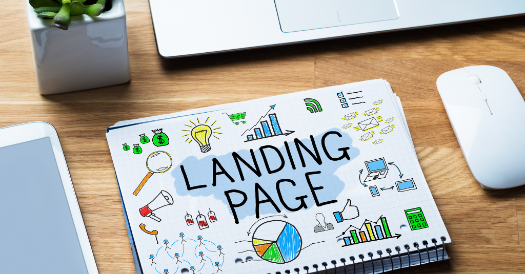
Landing pages can be used for commercial purposes; to generate leads and sales, and ultimately drive revenue in your business. However, there’s so many different ways to build a high converting landing page, so what exact steps should we follow to achieve our goals with landing pages?
How is a Landing Page Different from a Website?
A website is used to showcase a brand story and message, demonstrating the company’s reputation through its content and information. Generally, a website illustrates a company’s main products or services and provides information around these.
On the other hand, a landing page has a specific commercial objective that ultimately relates to generating more revenue for the business. There are various objectives that a landing page can help achieve, including:
- Lead generation
- Sale generation (for example, a product sale)
What are the Different Types of Landing Pages?
There are many types of landing pages, but none of them are necessarily better than one another. Instead, it’s the main ingredients that make up a landing page which influence its success.
Despite this, we’re going to take a quick look at the different types of landing pages you can build.
Short form landing pages
These are shorter landing pages with less content on the page. They rely on easily and quickly digestible content to convince visitors to act on the desired goal. Basically, this landing page follows the principle of “less is more and generally will rely more heavily on images and visuals than copy.
Long form landing pages
These leverage content to educate users about the product or service and persuade them to take action. They usually include far more copy, images and video than a short form landing page. When businesses sell products or services that are quite complicated or require a big commitment, these landing pages can come in handy.
Lead magnet landing pages
These leverage a lead magnet with a lead form to convert users into leads. A lead magnet is a free piece of content that can be offered in exchange for filling out a lead form. These are great when you want to leverage email marketing to educate your user and introduce visitors into your sales process.
Lead form landing page
These leverage a lead form but do not offer a lead magnet in return. Generally, they are contact based, quote based, or enquiry based forms and are best for service based businesses looking to capture leads without using a lead magnet.
Product landing page
These focus on selling a product or products. All of the copy, images and other elements on the landing page are selling the product, trying to persuade the user to purchase. These are best for ecommerce stores focusing on selling a specific product.
Advertorial landing page
These are landing pages that are designed to look like an organic news story. In other words, they tell a story of some kind or provide information relevant to the user, similar to a blog. The difference between a blog and an advertorial is that an advertorial’s main purpose is to persuade the user to take a certain action while educating them, while a blog focuses only on educating the user.
Main Ingredients of a High Converting Landing Page
The main ingredients of a high converting landing page are:
- Headline
- Images
- Copy
- Video
- Call to action
- The offer
Headline
The headline acts to capture attention and pull the user into continuing on the landing page. A good headline utilises curiosity and is benefit driven, capturing attention by being strange or outrageous in some way. Out of all the elements on a landing page, the headline is one of the biggest impactors of conversions.

Right from the get go, Code Academy uses a headline that is clear, gets to the point, communicates a benefit and is curiosity driven – you’re left wondering, what is the easiest way to code?
Images
These can help improve conversions or capture attention, but they aren’t the biggest impactor. An image that drives conversions is relevant to the message being delivered and accurately represents the buyer persona. For example, an image of a young person smiling on a landing page that is trying to sell aged care services won’t help improve conversions.
When we use images, we want to make our audience feel certain emotions, as it is these which inspire action. One way we can do this is by showing images of our target audience smiling while or after using the company’s product or service. This helps create an emotional connect between our product or service and the emotion that we expect the buyer to feel, and this can evoke the same emotions in our target audience as they scroll through the landing page. However, if the image isn’t of a person, that’s okay as well, as long as it is relevant.
All in all, images act to support the emotional triggers that are evoked from the copywriting.
The way you use images on different types of landing pages will change depending on that landing page. For example, on a lead form landing page, you’ll want to avoid using too many images because you risk losing the attention of your audience. On the other hand, on a product page you’re going to want to include many more images to display the product. As such, depending on your objective and the type of landing page you’re using, the way you use images will be slightly different. However, the purpose and impact of images on landing pages remains the same each time.

In this example, the image used adds to the copy on the left-hand side by suggesting that the Qualification will lead to satisfaction. This is conveyed through the student’s smiling face while completing the course. In this way, the image plays on emotional triggers and supports the flow of the copy. This is a great example of images in use on a landing page.

In this example, the image used supports the copy, replicating the emotional relationship a dog owner has with their dog. In this way, the image helps relate these emotions to the product being sold and creates an emotional response in the dog owner interacting with this landing page. The image here could be improved by increasing the quality of the shot, in terms of placement, colour, lighting and more, however, it still works well to support the copy. This demonstrates that even without the highest quality photos, it is still possible to achieve a result that works.
Copy
The copy on your landing page has to be dialled in and needs to have a Unique Selling Proposition (USP aka Unique Value Proposition) and be benefit-focused.
Having a strong USP means having two things:
- A Big Idea: something that’s new and different and solves a problem. For example, ‘New Ancient Secret Ingredient is being used to solve diabetes’. For lead generation, when we use lead magnets, we don’t necessarily have to use a big idea.
- Unique Mechanism: this gives your prospects hope that this time, with your offer, things will be different for them and they’ll finally get the results they want. In other words, the unique mechanism is all about showcasing the solution in a very specific way.
Being benefit-focused means answering how your benefits are different to the market, how your product or service is better, and how your audience will benefit from choosing your company.

In this example on the landing page for ASANA, we can see benefit focused copy. This copy tells users clearly and simply exactly what they’re going to get by using ASANA, focusing on the benefits that the user will receive.
Video
Video doesn’t necessarily need to be used, however, it can be used on a landing page to:
- Increase the amount of time users spend on your landing page (and thus increase your chances of conversion).
- Help deliver a message in a concise and easy-to-deliver way.
- Capture attention, engage your audience, and persuade the user.
On our RedPandas ‘What is HubSpot?’ page, we use videos to help deliver the message in an easier way, to keep users engaged on our page for longer and add value to users by adding to the copy that is already there. For reference, one of the videos we use on this page has been added below:
Call to Action
There’s argument around whether you should include a call to action (CTA) above or below the fold, what colours your CTA buttons should be and more.
However, it’s really simple. A strong call to action should stand out on the landing page, from a design perspective. This means choosing a colour that contrasts to the other colours for your CTA button and making sure your form stands out on the page.
From a copywriting point of view, the message must be clear, concise and specific. For example, it might look like this: “Download Info Pack Now” or “Enquire Now”.

In the above example, the headline acts to tell the user exactly what to do. The sub headline beneath this reiterates the point and tells the user what they will receive. Finally, the CTA button is clear, concise and specific, making it a great CTA.
So, how do you approach something that’s hard to sell a story around?
What makes a landing page successful isn’t just the five core elements; it’s about the story and the message and these have to be strong enough to compel someone to take action. However, sometimes you won’t be able to tell much of a story due to the type of service or product being used. For example, plumbing services don’t have much of a story around them. The problem experienced is pretty straightforward and the solution offered is to the point.
When it’s hard to tell a story with your landing page because of your product or service, then one thing you could do is utilise a compelling offer. Using the plumbing service example above, we know that plumbing problems generally require somewhat urgent attention. As such, we could offer a free quote with no call out fee in order to persuade the user to take action.
Improving the Conversion Rate of Landing Pages
When you want to improve conversions on your landing page, you’ll want to a/b test different elements. But which elements should you A/B Test first?
- The headline is the first element we’ll want to test, because it’s one of the biggest factors in determining the conversion rate.
- Then, we would test copy as this makes an enormous impact on conversions.
- Following this, we could test any of the other elements on the landing page as these have some effect, but not as large of an effect on the conversion rate as the copy and headline.
You might also want to consider context when testing. For example, if you don’t have many images, then you probably won’t be able to test different images.
How to Troubleshoot Conversions
The first thing to look at is bounce rate. If your bounce rate is high, then you need to change your headline or main offer. Your main offer simply refers to the thing that you’re offering.
The second thing you’ll want to look at to troubleshoot your conversions is the heatmap. For example, if you see that the majority of users are stopping at a certain point, then you can change the message on that section to improve conversions.
How many conversions should I be receiving?
This depends on whether you’re working in ecommerce or lead generation. In ecom, a normal conversion rate is 2-5%, whereas in lead generation, a normal conversion rate is anywhere between 5-15%.
If you’re using a funnel, where there are multiple landing pages in succession of one another (such as a eBook landing page followed by a ‘book an appointment’ landing page), then you’ll want to look at landing page click through rate (% of users that go from first landing page to second landing page). A good landing page click through rate should be above 30%.
What’s the number one factor that makes all the difference in conversions?
The biggest differentiator between a high converting landing page and a low converting landing page is the offer used. The offer is simply what you’re promising to provide your customer.
“The offer is so important. Sometimes it’s just about changing the offer – if you have an issue with conversions then you will want to test the offer.”
Tony, Paid Media Specialist @RedPandas
Of course there are other things you can do to improve the conversion rate, such as adding social credibility, testimonials and playing with the above mentioned landing page ingredients, but the biggest impactor is always the offer.
Successful Landing Page Examples vs Unsuccessful Landing Page Examples
Here are two examples of the same service presented in two different ways:


Out of these two landing pages, one generated far more conversions than the other. Can you guess which one?
The answer is the first landing page. So, why did this landing page perform better? Well, everything on both pages are exactly the same, except for one thing – the offer.
On the first landing page, the offer adds an additional “2 weeks FREE” badge, whereas on the second landing page, this is not included. Simply changing the offer in this way resulted in significantly more conversions and sales.
Another example can be seen below.


Which do you think won out of these two? The answer is the second landing page.
We noticed that the offer on the first landing page wasn’t really generating any interest from users, so we decided to go for a lead magnet approach where we offer a free info pack. This approach worked far better.
As you can see, when you want to drastically change your results, the BEST and most EFFICIENT way to go about it is to play around with the offer before anything else. Now that we’ve found a successful offer for these two services, we have the flexibility to play around with other page elements, like the call to action, copy, images and more.
So, what’s next?
There’s so many different styles and forms when it comes to landing pages, so it’s hard to say what’s right and wrong, however, we do know the main elements that can be influenced to help us succeed when building landing pages.
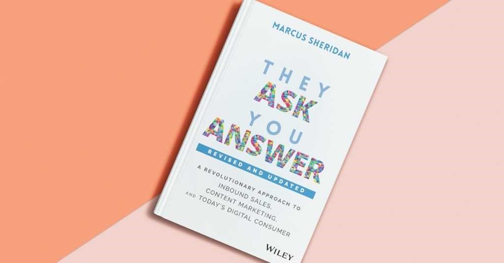
Do you want to increase the amount of leads and sales your website generates? You might want to check out the ‘They Ask, You Answer’ framework, which teaches you exactly how to do this.