You’ve probably spent countless hours crafting the perfect website, pouring your heart and soul into creating valuable content and eye-catching designs. And, like most websites, yours probably has a Contact Us page. But it’s no use creating any old contact us page. The reality is that there are best practices that make some contact us pages stand out more than others, and in this article, you’ll learn exactly what they are.
#1. Make Sure Your Visitor is Contacting the Right Person
Let’s face it – we’ve all been there, desperately searching for the right contact at a company, only to get lost in the labyrinth of departments and generic email addresses.
If your business juggles multiple departments, it’s essential to guide your visitors to the right person from the get-go.
Take a page from Grammarly’s book: they’ve nailed it by crystal-clear labels and direct links to Outlook:

#2. Use the Same Language as Your Visitors
You might assume because a contact us page requires a form that it’s pretty simple, you don’t really need to think about it.
The reality couldn’t be further from the truth.
Even though it’s a less wordy page in general, you want to make sure that you do use the same vocabulary and language that your customers use. After all, as a brand you want to connect with your customers at every interaction.
Taco Bell do a great job of this.

When you land on their “Contact Us” you can see the text at the top “Ok, let’s talk. You first.” They use the same language their customers use, making it feel like they’re talking to someone who genuinely cares. Plus, they’ve carefully chosen these words to make it clear that they’re all ears for your feedback. It’s like they’re handing you the microphone, letting you lead the conversation, and as a brand, that’s exactly what you want to do (at least when it comes to customers contacting you).
#3. Be Helpful
What’s the best way to get more customers and become the most trusted voice in your industry?
Answer customer questions. You might do this by building a learning centre on your website. And a contact us page is no exception.
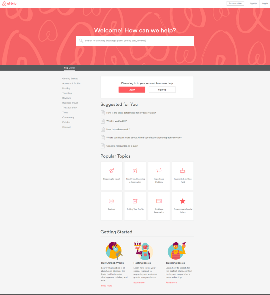
Ever visited a contact page and felt like you stumbled upon a treasure trove of answers? Airbnb sure knows how to do it right. Airbnb’s contact page isn’t just about reaching out; it’s like an FAQ page on steroids.
They welcome you with a friendly and inviting headline, setting the stage for a smooth experience. Instead of twiddling your thumbs waiting for a response, you can often find the answers you seek right there.
Remember, one golden rule applies to all pages – be helpful!
Whether it’s an FAQ page, a premium resource, or just a friendly chat, giving your visitors the tools to solve their own problems not only enhances the user experience but also keeps them hanging around your site a little longer. And most importantly, it builds trust, the ingredient for all sales.

#4. Show Your Visitors Why They Should Reach Out
Picture this: a visitor lands on your contact page, and you’re itching for them to make a purchase. But hold on a second! Not everyone who comes knocking is ready to take the plunge.
Your audience is a mixed bag of potentials at various stages in your sales funnel, and your contact page should cater to them all.
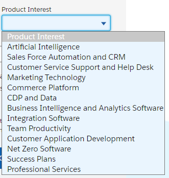
Take a page from Salesforce’s playbook – they’ve nailed the art of addressing diverse needs.

Whether you’re eyeing their CRM or just sniffing around for more info, they’ve got something for everyone.
For example, if you click on the “product interest” dropdown, you’ll see several items, each catering to a different need:

This is really the key to having a strong contact us page. It’s more than just a place to stick a form and hope customers reach out to you.
#5. Include a Video
Video is a great way to qualify your customer before they fill out a contact form, increase conversions on your contact us page, and build trust with your audience.
Our Partner Impact+ do a great job of this.
Video is a great way to qualify your customer before they fill out a contact form, increase conversions on your contact us page, and build trust with your audience.
Our Partner Impact+ do a great job of this.

The video puts a face to the brand and tells viewers exactly who should and shouldn’t be filling out their contact form. It also explains exactly what they’ll get once filling it out.
If you haven’t got video on your contact us page, you might want to consider shooting that video.
Read: 7 Videos to Help Sales Reps Close More Deals
#6. Streamline Communication
As a business, we want to make sure we’re doing a good job of matchmaking the customer with the right employee.
Officeworks do a great job of this.

Officeworks use the ‘Pick a Topic’ section to help customers find the exact information they need before reaching out and contacting the team. Sometimes this involves filling out a particular form relevant to that inquiry, and sometimes it involves more generic information.
By providing this information, Officeworks is helping customers get the exact care they need, all from their contact us page.
#7. Don’t Have a Video? Add a Picture
Many times, people have submitted a contact form just to be met with an auto-response from a general inbox.
If you can, add in the photo of the person that your visitors will be contacting like Convince and Convert does! It adds a level of personalisation and helps put a face to your company.

If it doesn’t make sense for you to put an image of a person, then at least include an image of your physical business. A great example of this is Dimosons.

#8. Let People Know Where They Can Find You
Taking the same example from above, Dimosons have an embedded Google/Apple maps that shows you where their office is. This adds credibility and helps customers find you if they do need to.
So, What’s Next?
Remember, your contact page is more than just a form and generic ‘Contact Us’ text. It’s a place you can build trust, form connections, and begin a relationship that turns into real revenue.
While a Contact Us page is important, you’ll also want to consider building a learning centre on your website. Answering your buyer’s questions transparently through a learning centre is the best way to become the most trusted voice in your industry.


